On the Dashboard, you can view charts illustrating a variety of specific information about the admissions process at your school.
Each user can customize the charts that appear on their Dashboard, without affecting other users, and some charts have further customization.
Some examples of information that can be viewed on Dashboard charts are: the number of openings you have per grade, the year-to-year changes in number of applications, and other data related to your prospects and admissions process.
In addition to the default charts, any prospect demographic fields that are validated can also be displayed as a chart.
Choosing Charts to Display on the Dashboard
- On the left navigation menu, click Dashboard.
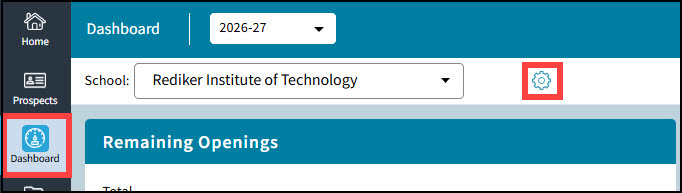
- Click the blue gear wheel
 located next to your School Name. The Select Dashboard Charts dialog box opens.
Use the arrows in the center to move Available Charts to the right under the Selected Charts list.
Use the arrows on the far right to manipulate the display order of the tiles on the Dashboard.
Click the Save button when you are done.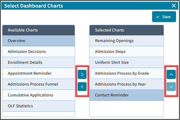

Default Dashboard Charts
| Chart Name | Chart Description |
|---|---|
| Admission Decisions | Used to view a pie chart of decisions, such as how many prospects accepted admission, declined acceptance, and are waitlisted. Displayed decisions can be customized. |
| Admission Steps | Used to view how many prospects completed or are in the process of completing Steps in the admissions process. |
| Appointment Reminder | Used to view appointments happening within a set number of days from the current day. Appointment information can be exported out to Excel. |
| Contact Reminder | Used to view a list of prospects who haven't been contacted in a set number of days. Prospects on this list can be sent an Email, and demographic and contact information can be exported out to Excel. |
| Cumulative Applications | Used to compare by year the number of applications received each month. The years displayed can be customized. |
| Enrollment Details | Used to view the number of prospects at each Step of the admissions process. |
| Gender | Used to view the gender count for prospects. The gender and type of chart can be customized. |
| OLF Statistics | Used to view the number of forms (of the same type) at each stage of completion. |
| Overview | Used to view the number of inquires, applicants, and enrollments each month. |
| Remaining Openings | Used to view the number of openings in your school and the number of openings per grade. |
| Workflow by Grade | Used to compare by grade how many prospects are at specific Steps in the admissions process, and/or have met specific Requirements. Steps, Requirements, and type of chart displayed can be customized. |
| Admissions Process by Year | Used to compare by year how many prospects were at specific Steps in the admissions process, and/or have met specific Requirements. Years, Steps, Requirements, and type of chart displayed can be customized. |
| Admissions Process Funnel | Used to view a funnel chart of how many prospects are at specific Steps in the admissions process, and/or have met specific Requirements. Steps and Requirements displayed can be customized. |
Customize charts by clicking the gear wheel ![]() in the upper right hand corner of the chart.
in the upper right hand corner of the chart.
Creating a Chart to display a Demographic Field's Data
Any demographic field that is set as a validated list can be added to the Dashboard as a chart.
Before creating the Chart, it is recommended that the validated list be set up with all entries that can be chosen for that field.
To create a Demographic Field Chart, go to the Demographic Field Setup - Either under Setup->Demographic Fields OR by right clicking on any field name on the Demographics screen and selecting field properties.
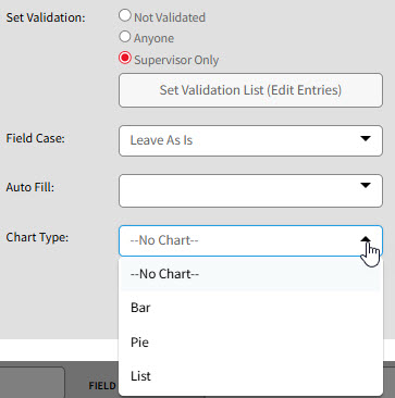
The Chart Type can be set to Bar, Pie or List by using the drop down box.
The Chart Type can also be changed on the Dashboard when configuring the field's chart.