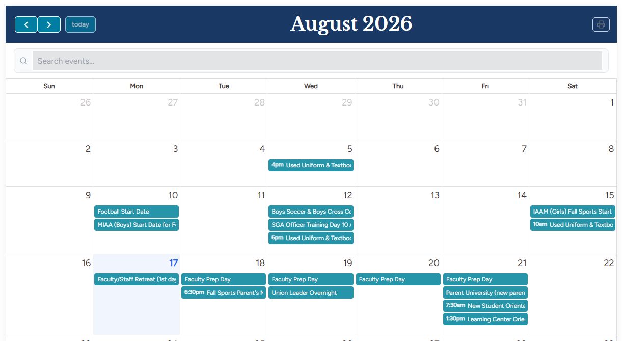
Display your calendar of events from your Rediker PlusPortals School Calendar integration. This widget will display events as a list or as a responsive monthly calendar. The widget also includes a handy search feature allowing your community to quickly find specific events.
This widget is an optional upgrade and replacement to the Calendar+ widget. The existing Calendar+ widget will continue to be offered and functional. Users do not have to switch but can do so voluntarily. If you want the upgraded widget on your site, you can use the notes below to assist with setting it up, or you may email support and request assistance with placing this newer widget on your site. We are happy to set it up for you! The biggest difference is that this widget offers more controllable content and design features, and specifically improved support for larger calendars (500+ events).
This widget was built, designed, and intended for connecting to your Rediker PlusPortals Calendar of Events. It will display events in a monthly calendar grid pattern, with options for Week View, Day View, and List View.
If you would like to upgrade the calendar widget on your website to this newer widget, we are happy to do if for you. Please email support@rediker.com.
Content
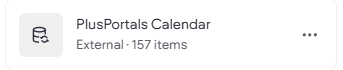
Collection Name
The exact name of the collection that you wish the widget to display data from. For example, if connecting to your PlusPortals, the typical collection name is "PlusPortals Calendar." You can find the name under CMS > Collections then look for the cylinder icon and collection name. By default, the widget will have "PlusPortals Calendar" entered as the name.
Alternatively, leaving this blank will allow you to either manually add events or connecting to a standard internal collection (not recommended).
Content Display Options
Settings that control the visible aspects of the events calendar.
Show Calendar Title
Allows you to enter and display an optional Title that can appear at the top of the Calendar. When toggled a "Calendar Title" Text field will display where you can input your desired title.

Show Weekends
Tells the calendar whether it should display Saturday and Sunday (weekends) or not.
Show Navigation Controls
Shows or hides the navigation options for the user.

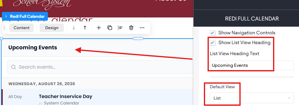
Show List View Heading
This is a separate control for when the Default View is set to List.
Events View
Let's you choose between Month, Week, Day, and List. Please note that, some content and design options only apply to the specific view used (like Month, or List).
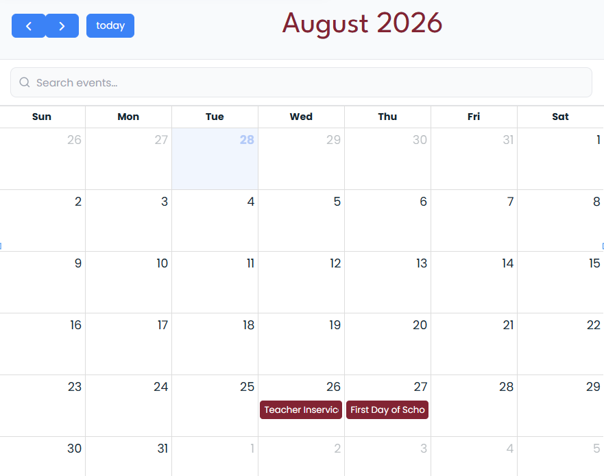
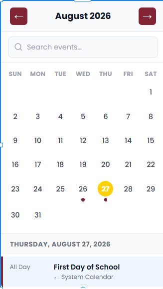
Month (Recommended)
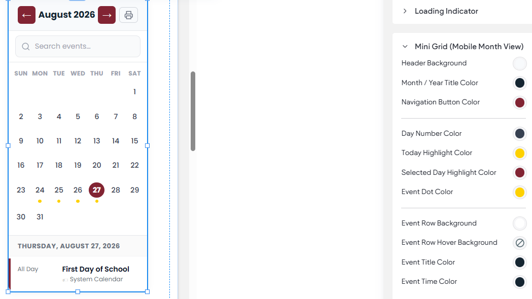
Places the calendar in your standard monthly view. Please note that in Month view, when on mobile it will be responsive and show a compact version of the month.
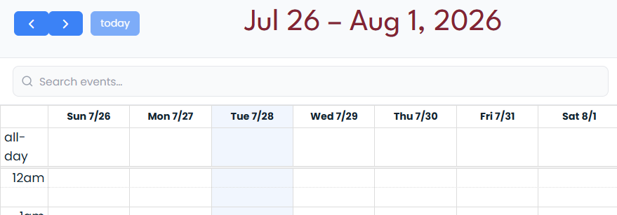
Week
Organizes and displays events in a Weekly Grid view.
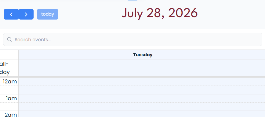
Day
Shows a Single day aga time.
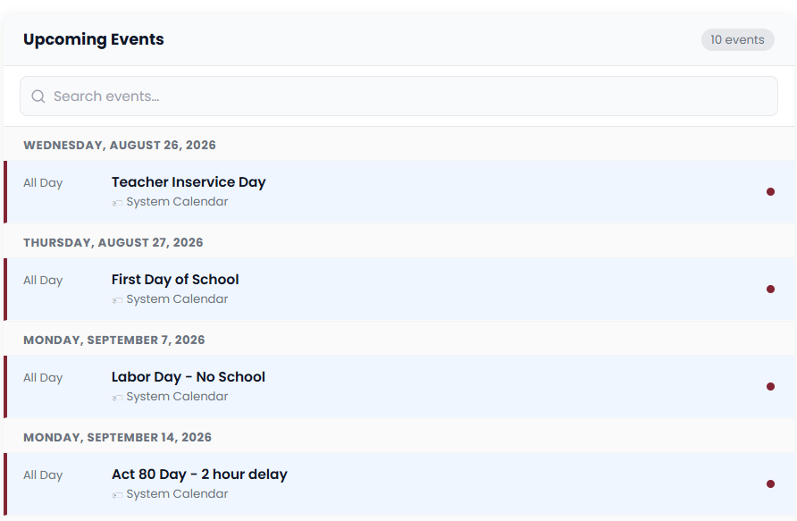
List
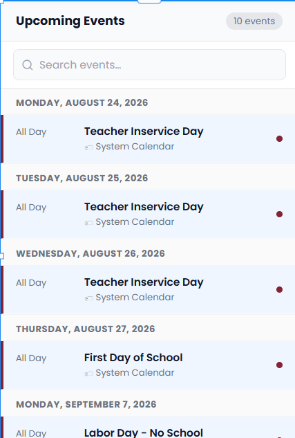
Shows upcoming events starting with today in a vertical list organized into pages. Perfect for showing a quick snapshot of events like on a Home page.
Number of Events to Display (Monthly View)
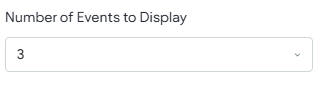
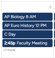
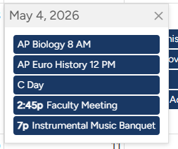
This controls the number of events that display on a given day in the Monthly Calendar view (1-5). When a day has more than the set number, then "+ More" will appear indicating more events are present. For example, if the Number of Events to Display is set to 3 and a day has 4 events happening, then "+1 more" will appear. Clicking it exposes the additional events in an overlay.
Total Events to show (From Today) (List View)
This setting applies to the List View only. You can choose to show All events or a range from 5-100 events from today's date. This helps with Mobile loading speeds as well as responsive design. Be sure to also set the Events Per Page option as well.
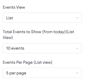
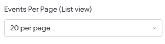
Events Per Page (List View)
This setting only applies to the List View, which is what is displayed in Mobile View. You can choose between 3 and 20 events per page. Based on the Total Events selected from the previous option; this option sets the items per page and then displays the events with the needed number of pages with Next and Previous navigation buttons at the button.

Design
These settings are used in the widget to alter the appearance of the various components, for example, text and background colors. Also, depending on which content options have been enabled or selected, some design settings may not display as they are not used. For example, if the "search feature" is toggled off, then the Search Bar design options will not be displayed.
Search Bar
Color options that alter the appearance of the search bar.

Calendar Title
If the optional title is being displayed these setting allow control over the Text like Font, Size, and Color.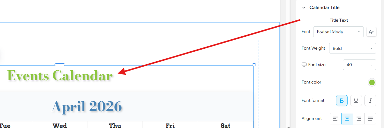
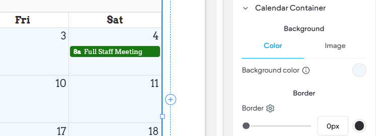
Calendar Container
Controls display items like background for the actual calendar.
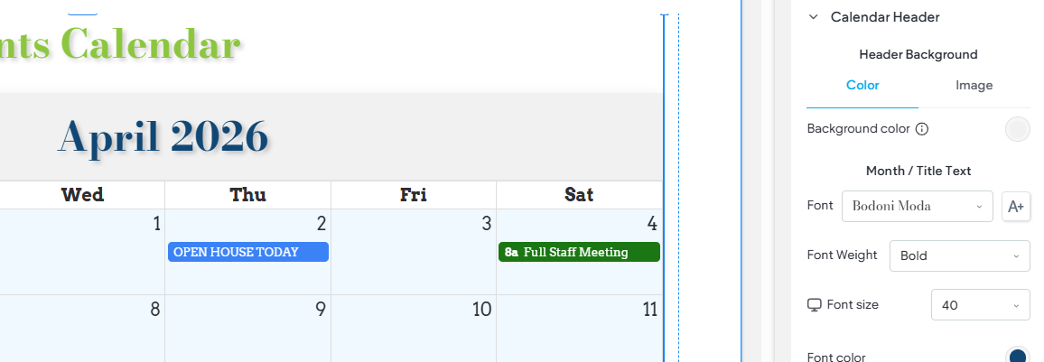
Calendar Header
Display settings for the Header area where the Month and Navigation appears. Also includes options impacting the Day/Date header text of the Month view.
Navigations Buttons
Display settings for the navigation buttons in top left for monthly view and at the bottom for list view.
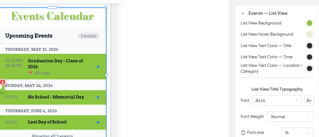
Events - List View
Various display settings which configure contextual items when the widget is in List View. For example, when in Mobile view the List View displays, these settings offer control over items like Font Size and Font Color. Also keep in mind, that colors can be chosen in PlusPortals, using this setting will override those colors.
Events - Desktop & Tablet (Monthly View)
Various display settings which configure contextual items when the widget is in Monthly View. For example, control over items like Font Size and Font Color for the events displayed on the monthly calendar.
Today Highlight
Controls the volors of today's date on the calendar to help make it more visible.

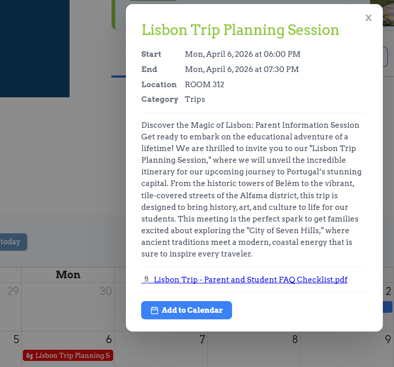
Event Popup
When an event is clicked a popup appears with the event details (time, description, etc.). These setting allow for some control over the popup and content like the background and font colors.
Loading Indicator
When this widget loads on the page it will very briefly display a "Loading Indicator" as it reads and loads events from the PlusPortals feed. These settings simply allow you to pick the color and background color of the indicator.
Mini Grid (Mobile Month View)
This special Month view is the responsive mobile friendly view that will be displayed on mobile devices when Month view is being used.