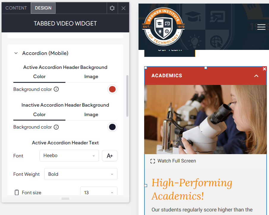
A widget used to display multiple videos, each with its own descriptive text and call to action. Videos can be uploaded to the site or displayed via a YouTube or Vimeo link. The tabbed desktop view helps to organize and showcase multiple videos while also prompting visitors into action with text and a button. In mobile view the widget will respond and place the videos into tabs vertically stacked like an accordion. A great widget when you want to show multiple videos in a compact and efficient way, while still grabbing your audience's attention.
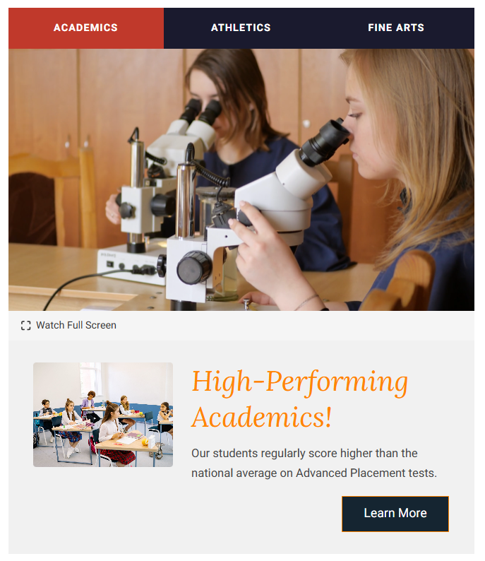
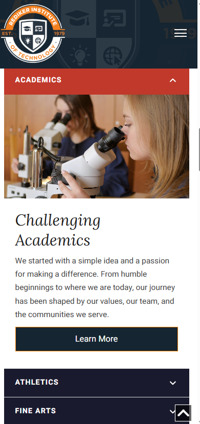
See the widget in action here - About | REDIKER IOT | Hampden, MA.
TABLE OF CONTENTS
Adding the Widget to a Page
To add this widget to a page:
- Open the widgets panel by clicking +Add
- Use the search to finds the Tabbed Video widget
- Drag and Drop it on the page.
- Add content as desired (like video, optional image, text, and button) and set design options as needed. See the Content and Design options below.
- Preview the content (including in Tablet and Mobile). Note that like most widgets you may have options to configure the style for Mobile view specifically.
- Republish the site.
Content
Use Collection as Data Source and Collection Settings
Videos are a supported internal collection field type. This widget can connect to a collection. Toggling this option will show the Collections Settings where you input the collections name, and the other fields.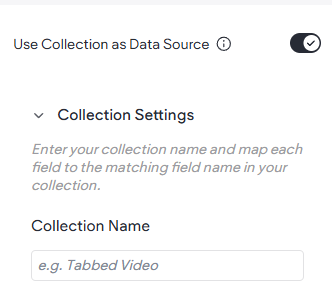
To use a collection you will need to setup a collection with the appropriate fields and types. Including- Tab Label (Text), Video URL, Image, Section Title, Description, etc.
Tabs (Manual) (aka Items)
The items you add will become the displayed content for each of the Tabs. Each item tab can contain multiple pieces of content like Tab Label, video, optional image, etc. Any piece of content may be left blank to simply not have it show.
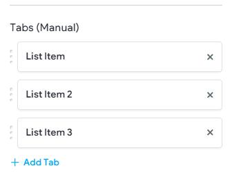
Tab Label
The text that will appear in the top Tab
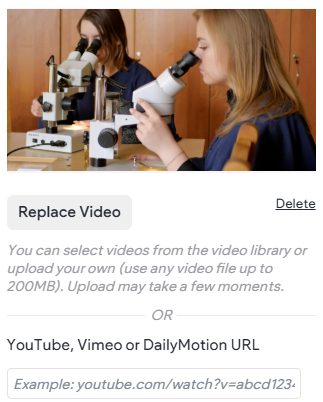
Video
The video that will play on the chosen Tab. The video can be an uploaded video or a link from Vimeo or YouTube.
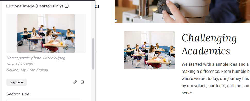
Optional Image
Allows the choice of displaying an image under the video alongside the text content description.
Section Title & Description
The title and description text appearing under the video. Title Text will automatically take on the site theme settings for H2 however default paragraph (respectively). These can be overridden the design options.
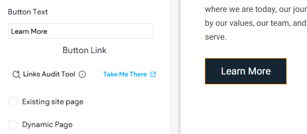
Button Text & Link
Configures the button appearing under the description text. For example, setting the text appearing as your link/button and where the link/button will take the visitor when clicked.
Autoplay Videos
Toggle the video to autoplay or not.
Loop Videos
Set video to automatically loop.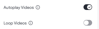
Design
Each of the below options are settings that configure the respective content piece (if displaying). Keep in mind that Section Titles, Description text, and Buttons are already reading from the site theme.
Tabs Bar
Controls the appearance of the Tabs across the top (Desktop and Tablet).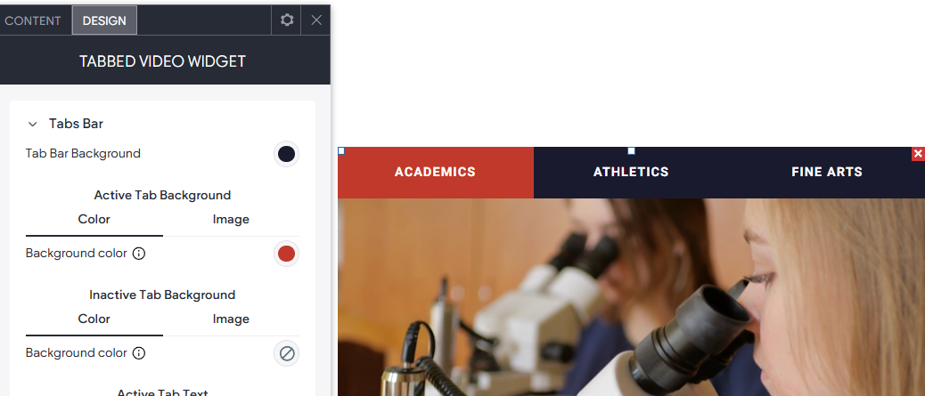
Content Area
Controls the Background Color and Padding of the content below the video.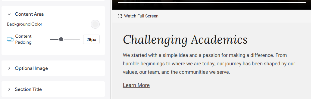
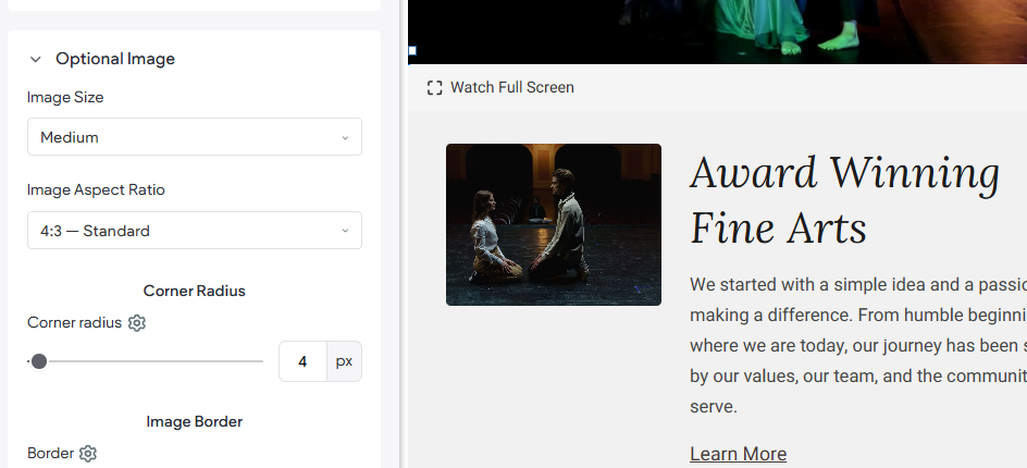
Optional Image
If choosing to display an optional image, these design options can be used.
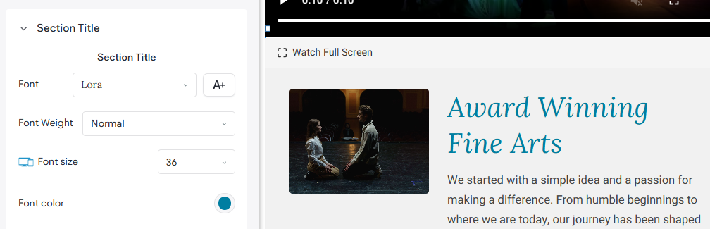
Section Title
Design options like Font, Color, and Size etc. that affect the Section Title (under the video).
Description
Settings that will impact the descriptive text.
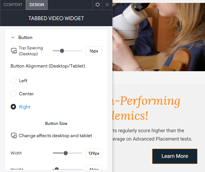
Button
Allows you to alter the appearance for the "call to action" link/button (if present). Configurable styles include font and background color, font size and color, hover color, and position of the link and more.
Fullscreen Button
A button that appears below the video to give users an option to expand the video to watch it as an overlay window.
Accordion (Mobile)
This widget automatically becomes an accordion on mobile devices, in otherwords the tabs will stack vertically on top of each other just like an accordion widget. These settings will adjust how it appears on mobile.