
The R Nav widget (short for Random Navigation) is a widget designed to provide secondary navigation to important information. While the typical navigation widget used in your main menu displays pages from your Pages panel, this widget is designed to be configured manually or to connect to a collection in order to display specific links. The widget can be set to vertical or horizontal orientation as well display an icon. This widget is perfect in your header and or mobile menu to provide quick access to utility navigation links for your community. For example, use the widget to highlight your PlusPortals link or even your AdmissionPlus login for applications. We frequently use this widget in the website header area for this exact purpose.

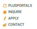
See this widget in action on this site: School Admin Software | REDIKER IOT | Hampden, MA.
Need help setting up this widget? Contact support@rediker.com
TABLE OF CONTENTS
Adding the Widget
- Open the Widgets Panel, click +Add
- Find the widget by using the search feature
- Drag and drop the widget on to the page
- Use the Content and Design options to configure the widget as desired. See notes below.
- Preview the widget on the page (including in mobile view)
- Republish the site.
Note if you want to use or edit this widget in a location that is locked like the Header or Footer, please contact support, we would be happy to set it up for you. Typically, we will connect the widget to a "Links" Collection enabling to update, change, and edit those links via the Collection.
Content
The content section of the widget is for setting the data source or manually editing the title and link as well as choices like layout.
Data Source (Manual / Collection)
Sets how you will configure your links either manually using the Link List Items or by connecting the widget to a collection (recommended). Connecting to a collection is recommended as it allows a table of links (collection) to be used as the source, which can be connected to multiple widgets on multiple pages. Also, it is easier to manage the links via a collection. For example, multiple R Nav widgets can be placed on the website like in the desktop header as well as the mobile menu and even the site footer, then all instances of the widget can then be connected to the same collection allowing for links to display and be managed from the single table. That way when a link is updated in the table it automatically updates everywhere it is being displayed. Additionally, by using a Category field you can specify which links are to be displayed in which locations. 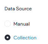
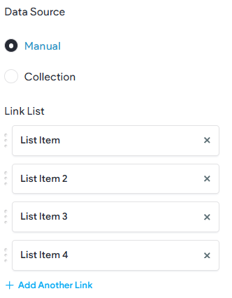
List Items (Manual)
If you choose Manual as the Data Source, you will then need to create and edit your links via the Link List items. Clicking on an item you can set the Link Text, Link, and Icon. This option is not recommended as it allows for less flexibility than the Collection option.
Collection Settings
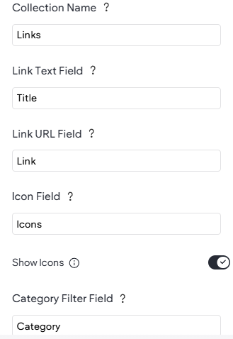
If the Data Source is set to Collection you will need to fill in these settings to identify your fields like Collection Name, Link Text, and more. For each item there is a tool-tip available by hovering on the question mark. You can also choose to Filter the widget to only display specific links from the collection. For example, have a Category field with "Header" as the filter Value.
If you need help setting up or connecting to the collection, just let us know!
Orientation (Desktop / Mobile)
For responsive design purposes, the widget can be set to Horizontal or Vertical by device type (Desktop v Mobile). This is for edge cases where if the widget is to be displayed in a location visible on both device types, it is often preferred to have it vertical for Mobile due to the narrow confines of that screen size.
Link Alignment
Allows you to set the links to left, center, or right alignment.
Design
Using the various design options and settings the widget can be customized to match your site theme and use case.
Link Text Style
By default, like most widgets, the widget will use the default text set in your site Theme. In the widget you are able to set and override the font, weight, size, and format.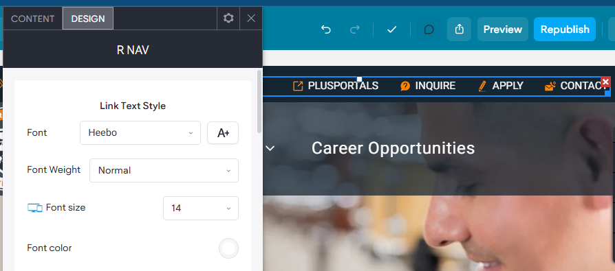
Icon Color, Width, & Spacing
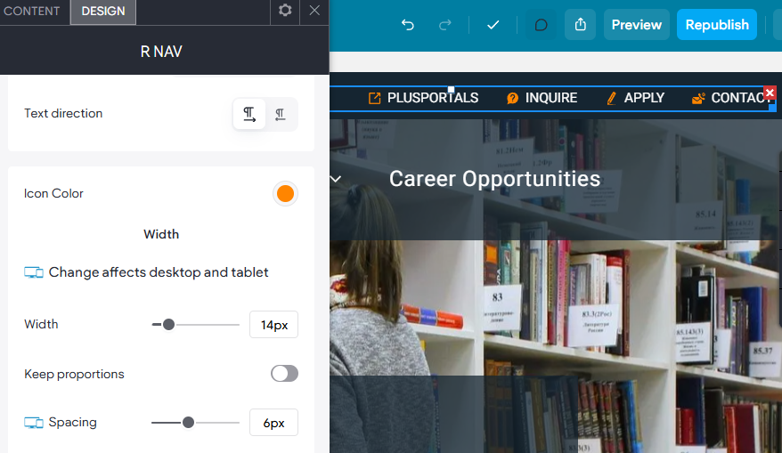
Allows you to set the Icon color (if displayed). You can also set the width; however, the Icon Width will only go as big as the Font Size currently set for your Link Text Style. The icon can only ever be as large/wide as the font size currently used. The width can be used to adjust it to be smaller if desired. The spacing option lets you set a number of pixels between the link text and the icon.
Hover Color
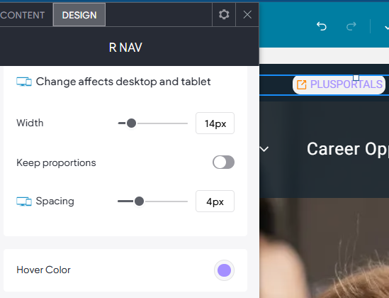
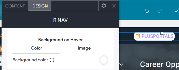
Hover color allows for a Link Text color to be chosen for when the use hovers over a link in the widget. There is also a Background color on Hover option as well.
Link Item
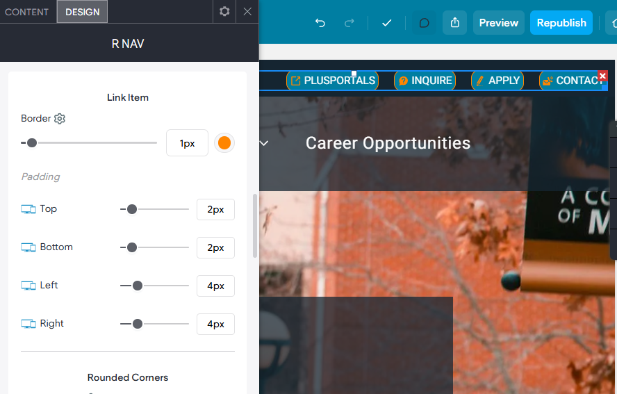
These setting allow you to add additional styles to the link items. You can add an optional border as well as tweak the invidial padding around the link items. You can also set a corner radius (rounded edges) as well as a background color.
Background on Hover
Allows for a color to appear as the background of the link when hovered over.
Space Between
Sets the space between each link item, as well as row spacing and vertical spacing.
Wrapper Color & Background
These impact the entire widget not the individual link items.